Image

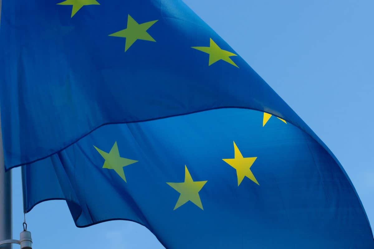
<figure class="ecl-media-container"><img alt="Jean Monnet banner" class="ecl-media-container__media"
    src="https://inno-ecl.s3.amazonaws.com/media/examples/example-image.jpg" />
  <figcaption class="ecl-media-container__caption">The European Commission has put forward ambitious yet realistic
    proposals for a modern EU budget. It is time for an EU budget that reflects rapid developments in innovation, the
    economy, the environment and geopolitics, amongst others.</figcaption>
</figure>Try it yourself on the playground
PlaygroundVideo (using <video> tag)
<figure class="ecl-media-container"><video class="ecl-media-container__media" controls=""
    poster="https://inno-ecl.s3.amazonaws.com/media/examples/example-image.jpg">
    <source type="video/mp4" src="https://inno-ecl.s3.amazonaws.com/media/videos/big_buck_bunny.mp4" />
    <source type="video/webm" src="https://inno-ecl.s3.amazonaws.com/media/videos/big_buck_bunny.webm" />
    <track kind="captions" label="English" src="/captions/bunny-en.vtt" srcLang="en" />
    <track kind="captions" label="français" src="/captions/bunny-fr.vtt" srcLang="fr" />
  </video>
  <figcaption class="ecl-media-container__caption">The European Commission has put forward ambitious yet realistic
    proposals for a modern EU budget. It is time for an EU budget that reflects rapid developments in innovation, the
    economy, the environment and geopolitics, amongst others.</figcaption>
</figure>Try it yourself on the playground
PlaygroundEmbedded video (using <iframe>)
Note: for embedded videos, the ratio is calculated based on the width and height provided with the video. It ensures a consistent display on all screen sizes.
It is also possible to manually specify a ratio if needed. Possible manual ratios are: '16-9', '4-3', '3-2' and '1-1'. Most common ratio is 16-9.
<figure class="ecl-media-container" data-ecl-media-container="true" data-ecl-auto-init="MediaContainer">
  <div class="ecl-media-container__media"><iframe title="New digital strategy" width="350" height="197"
      src="https://www.youtube.com/embed/fgi-GSCB6ho" frameBorder="0"
      allow="accelerometer; autoplay; encrypted-media; gyroscope; picture-in-picture" allowfullscreen=""></iframe></div>
  <figcaption class="ecl-media-container__caption">The European Commission has put forward ambitious yet realistic
    proposals for a modern EU budget. It is time for an EU budget that reflects rapid developments in innovation, the
    economy, the environment and geopolitics, amongst others.</figcaption>
</figure>Try it yourself on the playground
PlaygroundMedia container width
Media containers placed inside a grid container (.ecl-container) will expand to this container width; this is the case regardless of the content (image, video, embedded video).
To have a full width media container, the recommended way is to place it outside of the grid container.
However, if there is a need to have a full width media container inside the grid container, the css class .ecl-media-container--fullwidth can be used (just put it at the same level as .ecl-media-container).
Caution: if you plan to use full width media container using this fullwidth css class, we recommend to use the "website" preset, as some global rules here would improve the display (overflow-x: hidden).